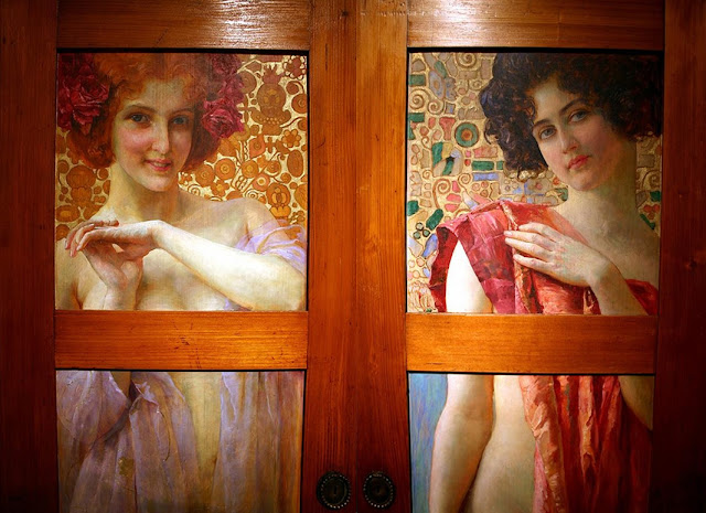
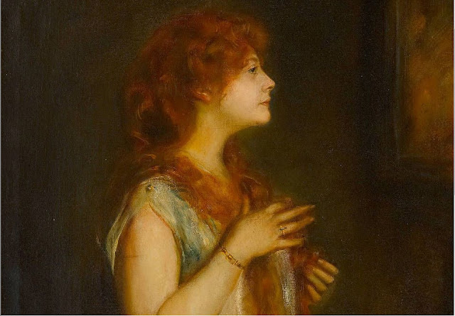
Again like in earlier post where I showed how pink or red clothes or background eliminates the dominance of red hair... also
golden warm tones around the model takes away the glow-effect of the red hair .
 |
| Mary Cassatt |
This picture is so freshly and so quickly painted, that she didn't get the perspective right in the
bench, but it doesn't really matter, The important thing is that the face and hands are clearly defined.
When You sketch an oil painting this quickly, be sure to use more oil in the color else it crimps and cracks on the places that get a thicker amount of paint.
 |
| Gabriel Dante Rossetti |
Sometimes when filling out spaces around a figure one has too be more careful with
perspective and sizes of elements ,else it gives some rather funny size problems.
Like the huge birds and tiny house?
 |
| Lajos Gulacszy |
 |
| John William Godward |
 |
| Angelo Morbelli |
A wonderful display of two lights.
The light from an electric source or fireplace against the day light. Who notice that she has red hair???
 |
Lyndall Bass
Vanessa |
Again a picture can be carried up by letting two parts or areas play against each other . Either from different texture or different finish or different lights or being shiny against mat , etc.
Here the rough diffuse and quickly painted background against the fine acurate attention
to skin, eyes, mouth, nose, ear and hair is enough to make it a picture and not a sketch.
I like when Artists think and chose what is important to show and why.
The only thing that bothers me is that one has to be very precise also with the diffuse sketched part, because even no matter how lacking of details the area can still climb in front of or behind the figure if the
stokes run along the contour or against it, specially when the contour is not defined on concave and convex
turns. As a rule the concave areas has a very slim and pale contour and the convex has broad and dark contour line. Watch out that you don't pull the background along the contour line like in this picture on the shoulder part for instance or along the face contour. That is a mistake!
 |
Arthur Hughes
This is how I found it, but it is actually a much bigger picture,
notice the color tone is different. People like to add effects in Adobe Photoshop and
pictures scanned from books have little resemblance in color to the real painting.
|
 |
| Arthur Hughes. |
 |
William Gale
Ophelia |
This picture falls out side the collection of warm colors, but I just noticed
that the two painters either used the same girl for a model or one inspired the other.
There was much competing back then ,
everyone tried to make a better expression out of the same subjects.
There is a backside to the Ophelia who in poems dies of unhappy love.
She is always pictured so young and innocent.
but actually in real life Ophelia symbolizes all the
poor unmarried girls who got pregnant and chose the river,
which blows up the stomach of all drowned mammals and birds.
Many young girls chose this way so no one would know about their shame.
 |
Rodolfo Amoedo
Juliette |
 |
| Andrej Remnojov |
 |
Julie Wolfthorn Thorn
Jewish Artist killed in Theresianstadt concentrationcamp |
 |
| Amadeo Modigliani |
 |
| Vojtech Preissig |
 |
| Edvard Okun |
 |
| Mersad Berber |
 |
| Joseph Edward Southall |
 |
| Vojtech Hynnais |
__Madame_Serusier_with_a_Parasol_1912.jpg) |
Paul Serusier
Madame Serusier in the garden |
All the women in this post had red hair but with the golden green or bluish background
it doesn't become the most important picture element.


__Madame_Serusier_with_a_Parasol_1912.jpg)


_The_Red_Dress_1915.jpg)


