
Here is a portrait of Denmarks talented realist Niels Strøbek
where he painted our Queen , she reprecents all what is refined ,clever and noble in Denmark.
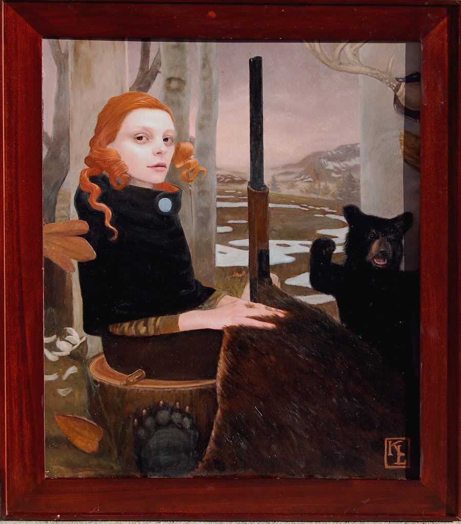
Now time changed our Queens red blond haircolour, but it can still be imagined in the next portrait
by Denmarks other talented realist Thomas Kluge
 |
| Thomas Kluge |
Thomas Kluge is without question the finest portrait painter we have in Denmark! The way he works so lovingly with every detail to get it right in light ,shade, colour, glow effect, in perspective , the exact size of every little dot of colour his composition are also impressive! A very clever man indeed!
It takes a painter to know what work lies behind his and I am full of admiration!!!!
Besides I think we are related ! I had a Kluge relatives from Dresden too.
So Thomas if you read this please write to me and lets find out if we relate.
Now I have to put in an extra word for this two talented danish artists who worked so hard and matriculous in their Art and never were appropriatly appreciated as they should have been
by the danish constipated Artworld and Artcritics,
.
Niels Strøbek is some years older than me,
I think he went a short time to the Academy and then jumped out.
I guess he discovered there were no teachers who could teach him anything he didn't know alreaddy.
Strøbek's paintings were rather small back then when he started, they were an inspiration to all of us other artists who also worked with the figurative image. I had the pleasure of being able to study some of his portraits close up in the house of Denmarks most talented pianist Elisabeth Westenholz. I visited her and her husband the organist Preben Steen Petersen a few times. Their sons were commisioned to be painted by Strøbek. I am amazed by the totaly even surface he makes, not a brushstroke can be detected.
What stringh and carefully collected mind.
Strøbek now paints big formats and likes rather big areas of each colour and the mind jump to pictures from the italian Renaissance and manneristic period.
I am not sure how much of the old renaissance pictures look the way today that they did back then in 1500-1600 . The artists choice of colours back then doesn't look the same
after centuries of restaurations and reparations.
after centuries of restaurations and reparations.
I was in Firenze after the big flodding and talked to one of the chief restaurators in the Uffizi Galleri. I asked if they really used so dominant red in their pictures?
He told me the collection in the gallery is a joke. What You see is nolonger what the Artists painted. They are results of bad restauration when taking away old varnish. This repainted areas destroid all the paintings.He was sure back then that the paintings had a brownish tone that the artist was aware of and therefor had chosen the valeurs and colours according to this finished apperarence .So the colours were stronger than they needed to be, to light trough the brownish varnish. He said back then they didn't have the clean colourless varnishes, like we have now.
Back to Thomas Kluge.
Back to Thomas Kluge.
Kluge was never admitted to the Academy of fine Arts in Copenhagen.I remember going to one of the
spring or autoom censured exhibition in Copenhagen I think it was on Charlottenbourg, pressing my way trough the huge crowd of people standing infront of his picture. It gave a "Sus" all the way into the soul as we say in Denmark, a long pulling wind sucking you into your own soul. I remember hearing people gasping .
None had ever seen anything like his amazing talent in Denmark. So many details!!!
That is the only time I ever damned the fact, that I can not afford to buy, what takes away my breath.
Several other young talents chose not to study in their own country's Academy, because of the obvious preferences for only certain ways of painting. Several of the most talented students chose
the school of the fine Grafic Artist Palle Nielsen and his wife Elsa .
Which seemed to be the only place which took this young talents serious
and entered students who aimed at learning to draw before learning to paint. Some of this
former students I consider to be Denmarks most interesting artists today.
They are all figurative and work with light details and fine tuned wellcomposed grafics and paintings.
 |
| Tatyana Struchkova |
Saw this young Russian artist in a wonderful Russian artblog called Liveinternet.ru
I like her paintings very much .One thing that jumps in my eye is that she uses the
square canvas. The last couple of years I used that format much, because it gives a wonderful almost magic attraction to the eyes. The composition gets something monumental ,
because of the strong tension between the sides.
I like Struchkovas sensitive and very objective portraits. This is a very fine portraist, who doesn't fall into the pit of beautifying her sitters.There is nothing vulgar or provoking, very very good pictures and a joy to look at them and her nice ideas. Douze point for Russia!!!
 |
| Tatyana Struchkova |
 |
| Tatyana Struchkova |
Wonderful soft smile in her face, please someone make my hair beautiful too.
Tatyana this is very nice!
 |
| Tatyana Struchkova |
 |
| Frankie Watt Sarah |
 |
Kris Lewis |
Here I show an American artist very skilled in working with surfaces .
I must say the half open mouths, pooting lips and horny looks gives a very vulgar impression
to me. I find it is a private provokative side of this portraid women, and to me
as a female artist and viewer it is not nice to look at.
Perhaps Lewis as a male artist find this inspiering , and male viewers will like this very much.
I do find that when Artists use realism from a Photograph and work on it with photoshop,some of the colours jump out of the picture and do not sit right towards the others!
One has to be so very very exact in messuring the distances between shadow, highlight and reflection when using photos. And be sure to get the same distances between this 3 elements in all the different colours in the picture else the colours jump out or in front or lies behind the rest of the picture elements and simply can't exist in the same light as one single harmony. It makes the picture look like a patchwork of different lights and in my eyes it becomes disharmonic. It looses the soft finish and feeling of truth.
I am specificly refering to the yellow blouse in the picture abowe. When you make a yellow this strong don't forget that all reflections in the face gets a yellow shade too! The shadow on the side of the nose is fairly dark compaired to the uplighted skin, use the same darkness and light in the hair and on the Yellow blouse else they seem to exist in another reality than the rest of the picture and fall out!
Many modern realist painters lack the patience to finish each colour into one overall light. And they are pleased too soon ,when all the canvas is filled out! Instead of taking that month longer to adjust all their areas in the picture to each other so it gives one light. It is actually easier to paint after a sitter than after a photo of a sitter.The different cameras have a tendensy to enchange surtain colours .Red and purple shades get too weak and out of harmony to the other colours! Many cameras are not capable of making these colours radiant enough and we have the same problem with the oilcolours. Red and purple natural pigments are not strongly radiant ! The artificial pigments fade after some years, so the only way to get the same radiation of colour is to play with optic trixs and lay blue strokes close to reds instead!So the twocolours gets virant because of each other. One can also do this when painting realistic .Not all colours have to be mixed into one.One can split them up without loosing the overall feeling of realism.
My suggestion is if an artist has to use photographs because of this very tidysome way of painting , you have to be extra concentrated on getting the darkness of the shadow in all colour the same compaired to the highlights of thise colours and do not use the photo for this, you have to remember to do it even if you can't see it. A bit of lying makes it more real.
 |
| Kris Lewis |
If an artist make a background out of imagination, do fit the directions of the light and shadow
to each others. Strange that the light come in from the right on the background and from the left on the woman. I agree that one is allowed to do what ever one wants to, as a painter.
But inconsequent light like this, have to have a purpose in the composition or in the story,
else it just looks like a mistake.
I agree mistakes are like spice in some cases, but they have to be on purpose.
The skin is wonderfully painted and so is the face. You made the right side of her armpit too high upp compaired to the left. It gives the illusion that one shoulder is a meter behind the other .
The head and neck are way too large for this tiny body!
This can happen if the the artist use a Photograph to paint after.
Some cameras have a zoom effect on the head and inner part of the face .
So one get this Doll effect with big heads and a thin body strangely hanging underneath.
 |
| Kris Lewis |
Nice idea to combine the aqua livingspace with the airy space.
 |
| Kris Lewis |
 |
| Kris Lewis |
The pictures of Kris Lewis are reblogged from the gallery page of
davidbsmithgallery.com
 |
| Kris Lewis |
Kris Lewis
This is an exelent and very funny picture!
 |
| Kris Lewis |
In this picture the doll effect is so exagurated that it gets interesting like Lucian Freuds earliest portraits
from the 50ties. I would have liked to add some more of Freuds pictures but could not find any with red hair from the 50ties, this is the only one I could find.
 |
| Lucian Freud Portrait of young girl 1950 |
extreeme fatness infected skin and dirty rags is very very talented painted and discovered, but he lost the poetic feeling that leave the viewer in a daydreaming positive mood.
 |
| Lucian Freud Girl with baret 1951 |
Perhaps I am wrong but I like a positive depiction of the motiv,
where one seeks and use the ability to love what one looks at
rather than pointing out in an exagurating way the negative and uggly sides
of the motive infront of ones eyes.
When we artist sit in front of something and paint we have a million
choises of what to show. I try to love what I see, fall inlove with the skin, the innosence,
the colour, the lines ,the expression the signs of Age or of Youth or of giving up.
The draft that push a hairstraw or the wonderful light that crawls over the skin
and make valleys and hills out of the facial landscape.
I take in the view boiling in love. But I do not fall in love with pimples or sweat or with
yellowish layers on teeth or with fungie under heavy tits.If this things are there infront of
my eyes I reduce their apperiance thinking, in a year they will not be there and the person I painted
will forever have to look at that bad hair day or alarming pimple .
I think it is a marvelous abbility to be able to paint also this things
and paint them so realistic and objective.
I just can't. I am not disgusted of age and not of sad skinconditions.
and I am not pretending to only love the beautiful and perfect side of the world.
I just still get arrosed of it beauty
so the decaing process with its final worms of death can wait in my repetoare until I get closer to it.
When I look in the mirror it is not me like I used to look ,but some of me is still there
and it is enough not to try, to teach myself to love decay yet.
So what is realism? Is it what we want to see or only what we do not chose to see?
Is uglyness more real?
Well then I can say there is nothing as ugly as a painting
where the artist tries to make the painting look like a photography .
The mistakes are so obvious and that is the real ugglyness compaired to reality
where all parts are embraced in one light and one softness,
where ugly or beauty has no importaince.
The eyes of the beholder shapes the reality!
Yesterday I got 8 huge bukets of flowers and filled all my vases with this wealth
put 8 big vases on my livingroom table which is rather small. The flowers stood a meter abowe the table
in an explosion of colours. Lilies gladiolus tulips and frecia trew their smells and exagurated blossum
to all sides. I never ever has so many flowers at home at one time.
In comes my 19 year old son, doesn't say a word, absolutely sees nothing different from any other day!
But if I had put a dirty oily motor on the table.
He would emidiatly have said waugh, where did you get that????
So that is why I am fasionated of portraits of the same person by different artists,
how differents is not the eye of the beholder and there is no real objective reality!
We simply see only what we want to see or need to see or am afraid to see.
 |
| Kris Lewis |
Very nice the way Lewis caught the different moods of the girl and rabbit
even if the haircolour is so artificial and jump out, the fine cativation in the moods
of the woman and rabbit makes it so loaded with reality.
 |
| Alan Coulson |
Englands great new talent , this young painter is sooo good!!!
There is silence in his pictures and the greys are radiating,
sending out a mysteriuos light and the air in his pictures can be felt.
I love his works it reminds me of Denmarks grand painter Vilhelm Hammershøj
who painted greys better than anyone in the world!
 |
| Vilhelm Hammershøj |
 |
| Chen Yifei |
Chinas big talent
 |
| Olle Hamngren Christina |
Olle and I studied together , he is a very talented painter , besides being an extremely
nice guy. I am happy that he also painted redblond women so I can show
his big talent in my modest blog. Olle is the best portraist for public portraits in Sweden.
Look at his brilliant public works on the homepage http://fly.to/hamngren/
 |
| Olle Hamngren |
Classic portrait in the tradition of Holbein
would any day settle for a fine portrait by Hamngren
Angelica Kristenson Aurelius is not a realist or Photo realist , but her
finetuned and compasionate impressions are so real.
I want to show her also her between the photorealists. I think
the way Angelica solves the backgrounds as in a sketched
drawing is exelent and gives a wonderful decorative touch
that we have not seen in Scandinavia since the Jugend period!
The way she finish her pictures so they always are light like a sketch is refreshing .
I like this choice not to be under the concequence of
finishing every millimeter when not needed! Angelica Kristenson transmits the
feeling and understanding of the artist as well as the inner life of the portraid person
without being under the tyrani of details.
In the portrait belowe there is the most importaint of all
in a portrait, namely the head and the hands. He really lies right and he rests,
the white areas almost seem to be parts of the dream situation.
He seems to be in the Sfere that has no material. He is desolved into Morfeus country.
the white areas almost seem to be parts of the dream situation.
He seems to be in the Sfere that has no material. He is desolved into Morfeus country.
 |
| Angelica Kristenson Aurelius |
 |
| John Currin The Clairvoyant |
The new american artist that with his portraits of
women with ballonbreasts bring in 700000 $ pr picture.
I saw an exelent portrait of a woman in furcoat with big sunglazes in London,
that he had painted before he saw a need to picture the provokative.
No comments:
Post a Comment